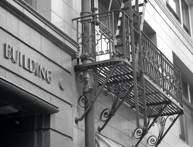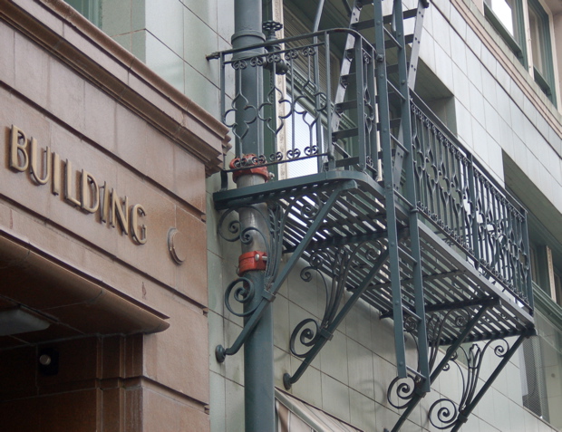
The Board of Trade Building, on the corner of SW 4th and Oak, downtown Portland, Oregon--do you like it better in black and white or color? I can't decide myself.

If I had Photoshop for an iBook, could I make the photos sharper and therefore more attractive? Is that something called Photoshop Elements? Anyone? Anyone?
Update: Mama's talking about wanting to come home. We ought to find out something about it this week.

9 comments:
I have no idea about photoshop, I think the B & W looks wonderful.
I looked at both photos again and they both look wonderful. The lettering and fire escape give the building a early 20th century look. Does it say Daily Planet Building?
I like the b&w photo better of the two. Sometimes b&w just says so much more :-)
You can make the photograph sharper using Photoshop elements or in Photoshop. It might not give you the look you want. Sharpenss often puts emphasis upon things you don't want to emphasize.
Since the photo is mostly black and white colors anyway, it looks like you used Photoshop or Photoshop elements to color in the portal or entrance and the red clamps on the pole. People use those programs for such things.
I like the black and white one better because the orange things on the pole are distracting to me in the colored one.
Photoshop is pretty expensive to buy. I went to a digital camera training at COMPUSA and they gave us Photoshop Elements free with the book for the class but since I had an iMac, the teacher emailed me photo elements because I couldn't use the small square disk that came with the program that was for PCs.
I accidently did something and my computer crashed so I lost it before I could use it and now have a different iMac in use. If you have an iMac then you should be able to do a number of things in iPhoto. I like Appleworks paint and draw program so much I put them on my new computer that didn't have them now that they don't have appleworks any longer since Safari arrived on the scene. I don't do anything but sometimes crop anyway. . .
I like the b&w. Someone once told me that in b&w you interpret the image while in color you just show it. I don't buy into that totally but they had a point. The b&w version interprets the image as kind of a retro look, or a vintage pic, also kind of moody.
As for photoshop, either elements, or CS3 will do the sharpening, but so will a new product called lightroom. I recommend you check out lightroom as an alternative. Also, a cheaper way to buy this software is to sign up for a class on how to use one of these at the local community college. Most have a continuing ed class on stuff about photography. As a continuing ed student you get the student discount, which is substantial.
One last recommendation, google photoshop or lightroom and look for some podcasts. There are plenty out there that will show you what the products can do.
Hi L, You can do a lot of minor simple effects with picassa and it's free... sharpening, tone changes, color management. I was shocked at what it can do. Elements is fabulous and more sophisticated. I'm gonna go with the color photo here as my preference...because it is ALMOST black and white. These are both magnificent photos.
Yes there is a Mac version of Photoshop Elements. Reasonably priced. I used PS Elements, for Windows, to resize and place my copyright on photos. On occasion I use PS to adjust the sharpness and/or lighting. Before I started using a digital SLR camera PS improved almost every photo. After I bought the DSLR PS adjustments (other than resizing and copyright) are rarely needed ... I especially like your inclusion the word "Building" in your photo today.
Hello Lynette. I just signed up with daily photo this week -- http://salemdailyphoto.blogspot.com
I'm practically your 'neighbor'!
I use Paint Shop Pro (Corel). Costs about the same as PS Elements (CS3 requires a mortgage!) and there is a huge community of users on the net with free tutorials. I usually tweak my photos a bit--crop, resize, then use the 'smart photo fix' tool.
Your Mom looks great.
Post a Comment