Info found at the Architecture Foundation of Oregon Web site:
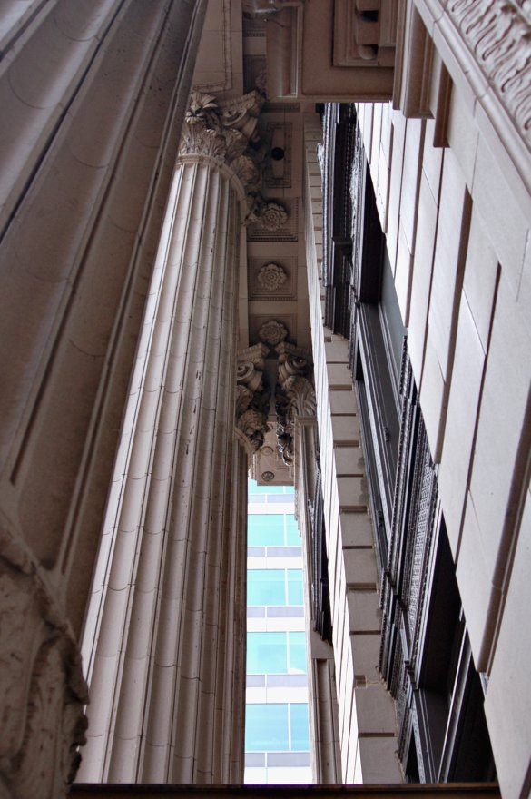
The US Bank Main Branch ... Architect: A.E. Doyle ... Built in 1917 (Please notice the building peeking through the space between the columns and the building. More about it soon.)
Built in 1917 and added to in 1925, the US Bank building was built in two stages that allowed it to occupy half of the National Bank Block in Portland. The location of the first project was at the corner of Southwest Sixth and Stark, later extended west to border Broadway. One of the west coast’s leading architects, A.E. Doyle designed the bank in the Classical temple style after the famous Knickerbocker Trust Bank in New York designed by McKim, Mead and White. This style was considered at the time by US Bank president J.C. Ainsworth to ‘embody the most modern type of bank architecture’.
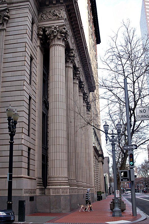
When visiting this magnificent building, the first architectural elements you are likely to notice are the freestanding monolithic columns designed in the Corinthian order. The Corinthian order was chosen for the entire exterior of the building, in part to set a contrast between this building and the Doric order of the rival First National Bank.

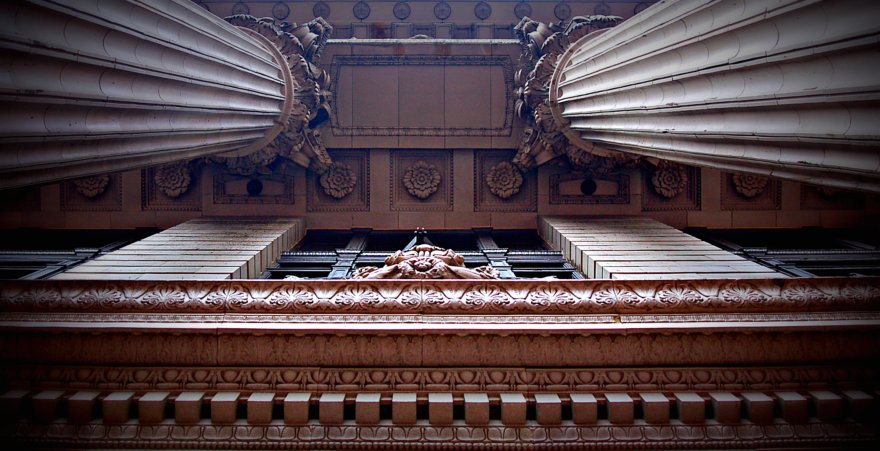
Looking up between two of the columns.

This photo contrasts the size of the pedestrian and the dog with the size of the columns. Monumental difference. The intersection: SW Stark is the one way street, eastbound, crossing SW 6th Avenue, looking north on SW 6th Avenue.
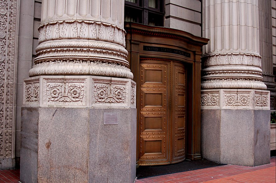
Large bronze doors to the lobby greet visitors at the entry. Arvard Fairbanks, a former sculptor and professor of the University of Oregon designed these doors, which were inspired by the fifteenth century “Gates of Paradise” located in the Baptistery in Florence, Italy.

The Bank’s interiors are just as ornate and detailed as the exterior, having been built in a period before the modern movement removed ornamental architecture, and in a time when no dollar was spared to create a masterpiece. Three different colors of marble are present in the main lobby; each traveling from far reaches around the world. The white marble that can be seen in the floor and columns came from Italy; the red marble in the floor traveled from Hungary; and finally, the black marble at the counters found its way here from quarries in Belgium. The ceiling displays excellent artistry in ceramic bas-relief that was made in casts that were hand carved. Architect A.E. Doyle carefully oversaw the hand painting of the bas-relief, which has never needed to be repainted.

6 comments:
By the time you got out of there I would guess you had a stiff neck.
I love all of the details of this building. I love old architecture.
Some amazing shots and angles in this one. What design!
This has to be one of your very best posts. Fantastic photos and your treatment(s) are also fantastic. They are so good, I seriously almost got dizzy looking at them. If you switch rapidly between #1 and #2 you'll swear you're falling!
The columns
^^I'm glad I'm not the only one who got vertigo from these amazing photos!
Post a Comment