Showing posts with label Venerable Properties. Show all posts

Thursday, November 20, 2014

Bicycle delivery person on the Burnside Bridge and the fantabulous Portland Oregon sign, brilliantly lit at night with neon and incandescent bulbs

-->

DSC_0240_HDR_square_BeFunky_null_1.jpg

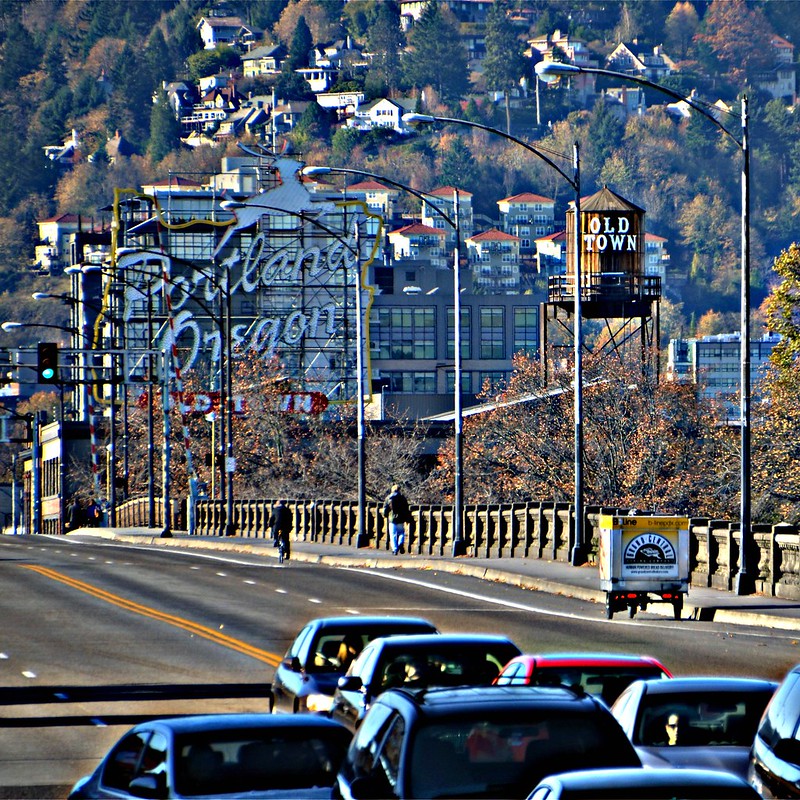
I took this photo last Saturday while I waited for the bus home after a great lecture at the Architectural Heritage Center. The delivery bicycle caught my eye, I stood up from the seat in the bus shelter and walked west on the sidewalk for a few steps, and took several photos as he pedaled along. I stood there, cold but bundled up in the sunshine, and wondered about how cold that delivery guy would feel once he stopped pedaling. As I took the photos, I realized I could get the neon Portland Oregon sign in the photo, too. Serendipity! I have cropped it into this square and altered it with HDR at BeFunky. The red-topped buildings are on the east side of the Tualatin Mountains, also known as the West Hills. They are well more than 23 blocks away from where I stood.

DSC_0326_HDR_square_BeFunky_null_1.jpg

It's easy to see why I like the sign so much--it's huge, colorful, and looks great as each word lights up. I took this photo on June 12, 2012, when the trees had all of their leaves. By the way, at one time the sign advertised White Stag clothing which explains the leaping stag at the top of the outline of the state of Oregon.

DSC_0216

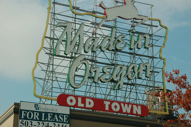
Here's the sign before the change to the current wording. I took this photo on November 5, 2010, because I'd been keeping up with the news stories about the sign--what to do with the wording, who would pay for the electricity to light it, who would pay for the maintenance. I didn't want to miss a chance to get one more shot of it. Lo and behold, those decisions were made--the city owns the sign and pays Ramsay Sign $2000 a month for electricity and maintenance, the funds coming from a parking lot's fees, and Art DeMuro, president of Venerable Properties which owns the building underneath the sign, donated $200,000 for the lettering to be changed--and on November 16, work began on the rewording.

DSC_0119

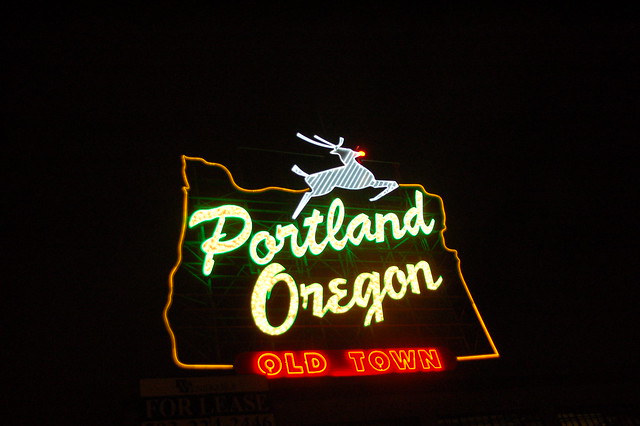
And here it is, November 26, 2010, on the night the new wording debuted. I stood on the sidewalk on the Burnside Bridge Friday night after Thanksgiving, waiting quite a while for the mayor to throw the switch. During the holidays, the stag's nose is red, an homage to Rudolph the Red-Nosed Reindeer. I read on the Internet that when the sign was lit, two of the neon rods in the stag's head had not yet been reattached after the change in lettering, therefore the blank spot underneath the antlers. One week later the work was completed. Ramsay Signs made the word Oregon in 1997 and the word Portland in 2010, matching the colors as closely as possible.

DSC_0099

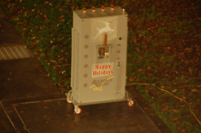
There's the red-handled switch. No mayor yet, but I did get a kick out of seeing this contraption rolled onto the sidewalk and plugged in so that it would be ready when he arrived. Naturally, once he did and I heard the countdown begin, I turned my camera on the sign. Who cared about taking a photo of the mayor when the sign lit up. Sorry mayor, not me.

Saturday, March 31, 2012

The AHC Hard Hat Tour of the Salvation Army Industrial Home, #1

About the Hard Hat Tour, found at Community NonProfit Resource Group--Portland: This Salvation Army building was the District Headquarters for Men's Social services for the state of Oregon, Eastern Washington, and all of Montana. Architecturally it is a GREAT building, designed by Frederick Manson White who came to the US in 1888. With the firm McCaw & Martin, he worked on downtown Portland's First Presbyterian Church, Dekum Building, and the Armory. In his own practice, he designed the Sherlock Building, Imperial Hotel, and the Auditorium Building. Actually, White did not design the whole building. In 1930 he designed the remodel which added the northern building to the southern building. In another post, I've got a special treat of a photograph which supports the fact that the southern building was a Salvation Army building, prior to the 1930 remodel. Our "hard-hat tour" will allow attendees to see the building before all of its restoration is complete. It is an opportunity for a behind the scenes look at the challenges, conditions, and innovative approaches for a superb adaptive reuse project. DSC_0703p We're standing inside the southern most section of the Salvation Army Industrial Home building which is actually two buildings remodeled into one. This part, erected in 1893, started as a hay and feed business. It's great that those huge, first-floor windows remained open, allowing the sun the illuminate the huge room for us. Our first speaker, Morgen from the Architectural Heritage Center, set the historical stage for the tour. Then a woman from Venerable Properties spoke of what had been here up to this point in time and about Venerable's plans for the building. DSC_0684p One view of the stairs we did not take to the second floor. The staircase is in the southern most section, too. DSC_0685p Looking up the staircase. I held the camera out across the red tape, knowing not to put my foot over there on that part of the floor. DSC_0683 Wonder what sort of lives were led by the men who laid these bricks back in 1893? This is the exterior, southernmost wall. DSC_0672picnik_HDR-ish One of my favorite items found on the Hard Hat Tour, this sign leaning against the wall which separated the newer portion of the building, the northern part, from the older, southern section. The remodel by Frederick Manson White took place in 1930 and gave the Salvation Army just what it needed, much more space to perform their services for Portland. And I don't mean chapel services, but the many ways in which they helped those in need. Here is the photo as altered at Picnik, HDR-ish. You may remember my lament about the April 19 closing of Picnik. I'm still not happy at all about it's disappearance from my photo/blogging toolbox, but I have found Ipiccy and PicMonkey, both of which give me great hope. See yesterday's post for evidence to their effectiveness. DSC_0672picnik_Gritty Here's the same photo, altered in Picnik with the special effect Gritty. DSC_0672ipiccy_HDR_picture_resized And here it is, altered at Ipiccy, HDR Picture. Seems to me a decent tool, although I will take me some time and some playing around with the tool to get used to this muted look. After April 19, I'll have to be happy with it, unless PicMonkey comes up with something more like Picnik's HDR-ish. DSC_0672ipiccy_Gritty Ipiccy's Gritty special effect. I'll bet you're looking forward to April 19 when I won't have all of these alternatives to shower on you! Ha, ha!