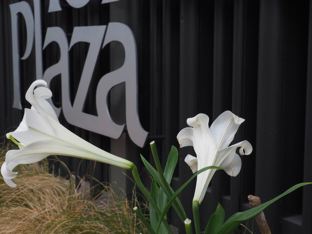
I couldn't get enough of these beauties. And I hope that someone in charge of their care cut off the spent blossoms. Because I'd hate to think that a passerby with a sharp knife just decided to take the three that are obviously recently removed. To me, the flower on the right looks as if it could be made of paper, complete with the curled petals.
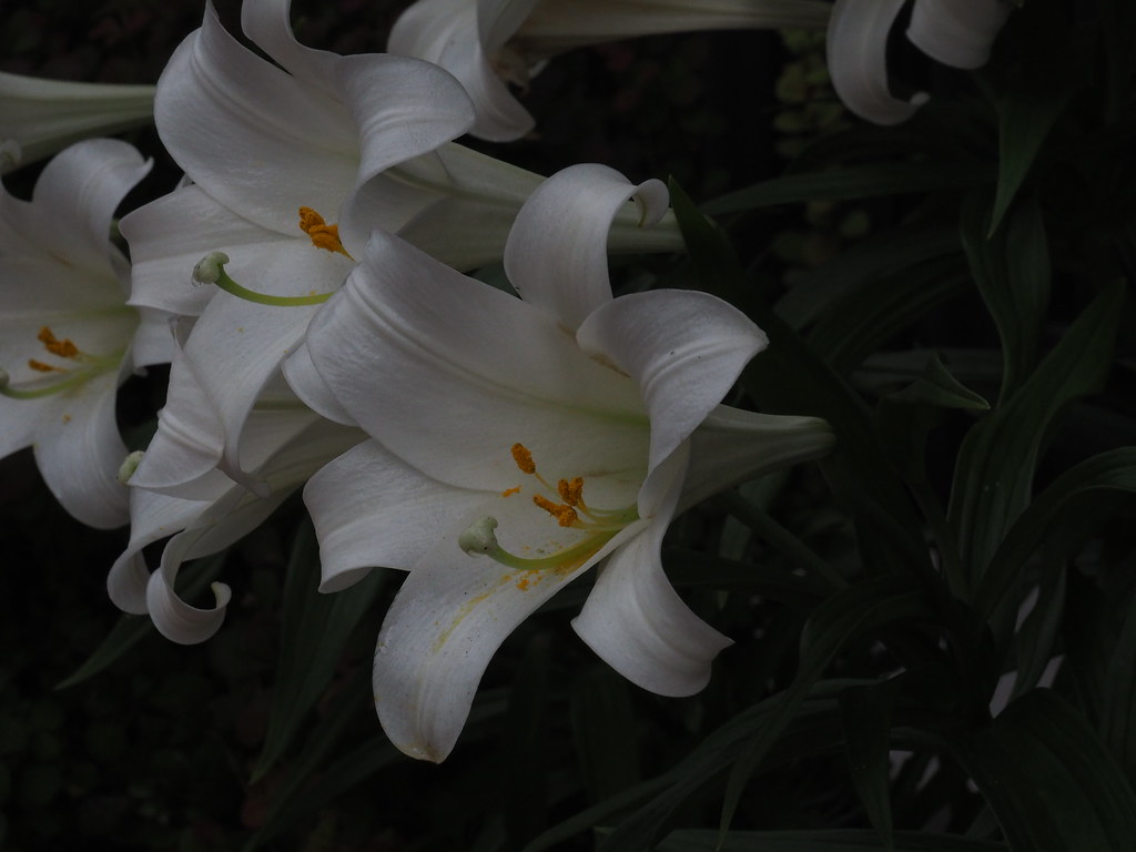
Do you like the mood of this shot, as I took it?
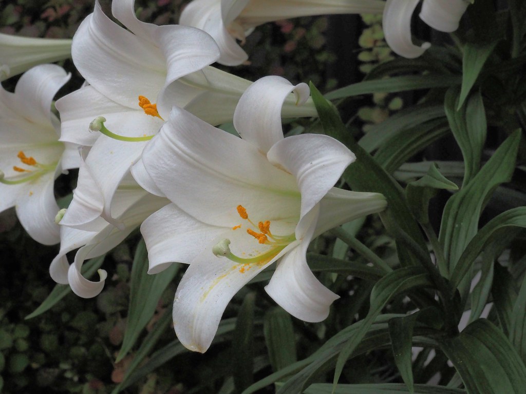
Or as it appears here after I clicked on Edit in Aviary, the Enhance, then Illuminate?

First, I didn't like a flower that was in the bottom left corner, so I cloned it out at BeFunky.
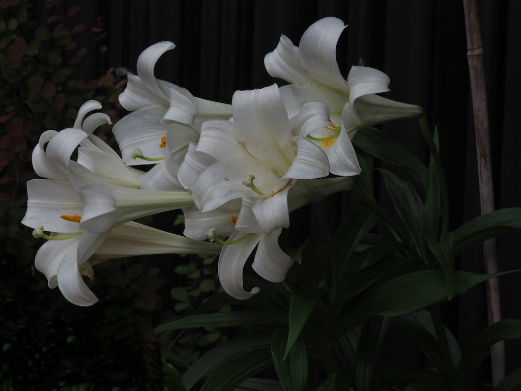
Then I wondered about the exposure, so at BeFunky, I worked on the highlight and the fill light. Hmmm.
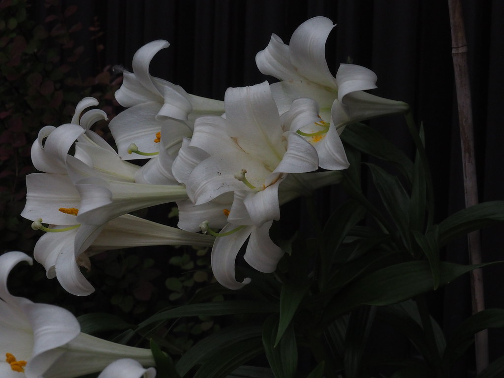
This is the original photo. Do you agree with me that the flower in the lower left corner detracts from what I wanted in this photo? I'm curious. Thanks!
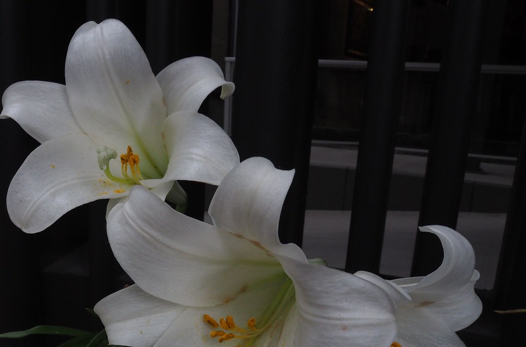
All I did with this one was crop off a spent blossom and some ugly concrete in the background--driveway, retaining wall. I really like the patina on the petals, the sheen.

2 comments:
I totally agree with your improvements, though the lilies are very pretty by themselves.
They're very pretty!
Post a Comment